您现在的位置是:网站首页> 编程资料编程资料
用纯css3实现的图片放大镜特效效果非常不错css3动画鼠标放上图片逐渐变大鼠标离开图片逐渐缩小效果基于CSS3实现鼠标滑过图片上移代码无需JS和jQuery代码实现CSS3鼠标浮动放大图片
 2021-09-06
1202人已围观
2021-09-06
1202人已围观
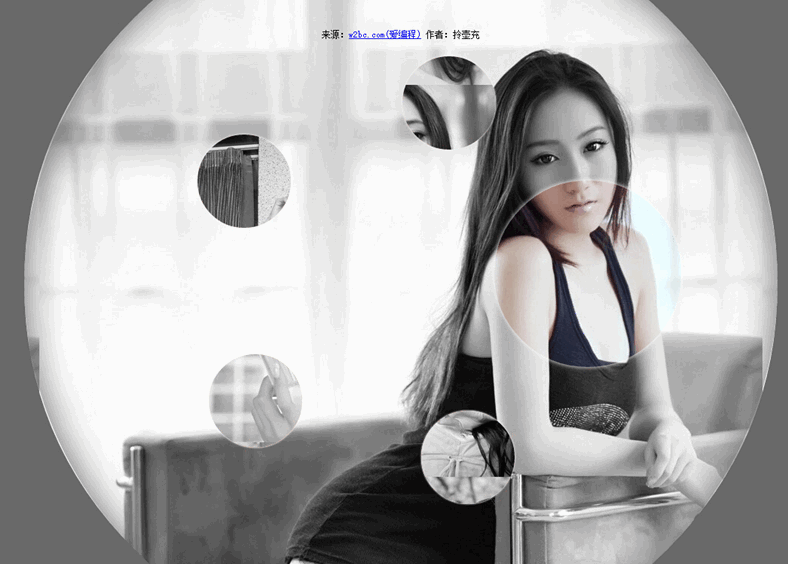
简介 一款用纯css3实现的图片放大镜特效。页面打开五个小图显示于页面。当鼠标经过图片时,当前图片以灰色背景图的形式展示,需要的朋友不要错过
今天要给大家分享的的一款用纯css3实现的图片放大镜特效。页面打开五个小图显示于页面。当鼠标经过图片时,当前图片以灰色背景图的形式展示。效果非常不错。
源码下载
实现的代码:
html代码:
css代码:
.gallery
{
list-style: none;
}
.gallery:before, .gallery__item:last-child
{
position: fixed;
top: 50%;
left: 50%;
margin: -31.25em;
width: 62.5em;
height: 62.5em;
}
.gallery:before
{
z-index: -1;
border-radius: 50%;
content: '';
box-shadow: inset 0 0 5em dimgrey, 0 0 0 50vw dimgrey;
}
.gallery__item
{
background-blend-mode: luminosity;
transition: -webkit-transform 0.5s cubic-bezier(0.175, 0.885, 0.32, 1.275), background-image 0.5s;
}
.gallery__item:not(:last-child)
{
position: absolute;
top: 50%;
left: 50%;
width: 32vmin;
height: 32vmin;
border-radius: 50%;
box-shadow: 0 0 .5em white;
}
.gallery__item:nth-child(1)
{
margin: 13.87457vmin -4.53223vmin;
-webkit-transform: scale(0.5);
background: url("imgs/1.jpg") 50% 50% fixed whitesmoke;
}
.gallery__item:nth-child(1):hover
{
-webkit-transform: scale(1);
background-blend-mode: normal;
cursor: pointer;
}
.gallery__item:nth-child(1):hover ~ :last-child
{
background: url("imgs/1.jpg") 50% 50% fixed dimgray;
}
.gallery__item:nth-child(1):hover ~ :last-child:after
{
opacity: .001;
}
.gallery__item:nth-child(2)
{
margin: 4.13825vmin -40.86867vmin;
-webkit-transform: scale(0.5);
background: url("imgs/2.jpg") 50% 50% fixed whitesmoke;
}
.gallery__item:nth-child(2):hover
{
-webkit-transform: scale(1);
background-blend-mode: normal;
cursor: pointer;
}
.gallery__item:nth-child(2):hover ~ :last-child
{
background: url("imgs/2.jpg") 50% 50% fixed dimgray;
}
.gallery__item:nth-child(2):hover ~ :last-child:after
{
opacity: .001;
}
.gallery__item:nth-child(3)
{
margin: -33.42845vmin -42.83746vmin;
-webkit-transform: scale(0.5);
background: url("imgs/3.jpg") 50% 50% fixed whitesmoke;
}
.gallery__item:nth-child(3):hover
{
-webkit-transform: scale(1);
background-blend-mode: normal;
cursor: pointer;
}
.gallery__item:nth-child(3):hover ~ :last-child
{
background: url("imgs/3.jpg") 50% 50% fixed dimgray;
}
.gallery__item:nth-child(3):hover ~ :last-child:after
{
opacity: .001;
}
.gallery__item:nth-child(4)
{
margin: -46.90963vmin -7.71779vmin;
-webkit-transform: scale(0.5);
background: url("imgs/4.jpg") 50% 50% fixed whitesmoke;
}
.gallery__item:nth-child(4):hover
{
-webkit-transform: scale(1);
background-blend-mode: normal;
cursor: pointer;
}
.gallery__item:nth-child(4):hover ~ :last-child
{
background: url("imgs/4.jpg") 50% 50% fixed dimgray;
}
.gallery__item:nth-child(4):hover ~ :last-child:after
{
opacity: .001;
}
.gallery__item:nth-child(5)
{
margin: -17.67475vmin 15.95615vmin;
-webkit-transform: scale(0.5);
background: url("imgs/5.jpg") 50% 50% fixed whitesmoke;
}
.gallery__item:nth-child(5):hover
{
-webkit-transform: scale(1);
background-blend-mode: normal;
cursor: pointer;
}
.gallery__item:nth-child(5):hover ~ :last-child
{
background: url("imgs/5.jpg") 50% 50% fixed dimgray;
}
.gallery__item:nth-child(5):hover ~ :last-child:after
{
opacity: .001;
}
.gallery__item:last-child
{
z-index: -2;
}
.gallery__item:last-child:after
{
position: absolute;
top: 0;
right: 0;
bottom: 0;
left: 0;
opacity: .999;
background: dimgrey;
transition: opacity 2s;
content: '';
}

源码下载
实现的代码:
html代码:
复制代码
代码如下:css代码:
复制代码
代码如下:.gallery
{
list-style: none;
}
.gallery:before, .gallery__item:last-child
{
position: fixed;
top: 50%;
left: 50%;
margin: -31.25em;
width: 62.5em;
height: 62.5em;
}
.gallery:before
{
z-index: -1;
border-radius: 50%;
content: '';
box-shadow: inset 0 0 5em dimgrey, 0 0 0 50vw dimgrey;
}
.gallery__item
{
background-blend-mode: luminosity;
transition: -webkit-transform 0.5s cubic-bezier(0.175, 0.885, 0.32, 1.275), background-image 0.5s;
}
.gallery__item:not(:last-child)
{
position: absolute;
top: 50%;
left: 50%;
width: 32vmin;
height: 32vmin;
border-radius: 50%;
box-shadow: 0 0 .5em white;
}
.gallery__item:nth-child(1)
{
margin: 13.87457vmin -4.53223vmin;
-webkit-transform: scale(0.5);
background: url("imgs/1.jpg") 50% 50% fixed whitesmoke;
}
.gallery__item:nth-child(1):hover
{
-webkit-transform: scale(1);
background-blend-mode: normal;
cursor: pointer;
}
.gallery__item:nth-child(1):hover ~ :last-child
{
background: url("imgs/1.jpg") 50% 50% fixed dimgray;
}
.gallery__item:nth-child(1):hover ~ :last-child:after
{
opacity: .001;
}
.gallery__item:nth-child(2)
{
margin: 4.13825vmin -40.86867vmin;
-webkit-transform: scale(0.5);
background: url("imgs/2.jpg") 50% 50% fixed whitesmoke;
}
.gallery__item:nth-child(2):hover
{
-webkit-transform: scale(1);
background-blend-mode: normal;
cursor: pointer;
}
.gallery__item:nth-child(2):hover ~ :last-child
{
background: url("imgs/2.jpg") 50% 50% fixed dimgray;
}
.gallery__item:nth-child(2):hover ~ :last-child:after
{
opacity: .001;
}
.gallery__item:nth-child(3)
{
margin: -33.42845vmin -42.83746vmin;
-webkit-transform: scale(0.5);
background: url("imgs/3.jpg") 50% 50% fixed whitesmoke;
}
.gallery__item:nth-child(3):hover
{
-webkit-transform: scale(1);
background-blend-mode: normal;
cursor: pointer;
}
.gallery__item:nth-child(3):hover ~ :last-child
{
background: url("imgs/3.jpg") 50% 50% fixed dimgray;
}
.gallery__item:nth-child(3):hover ~ :last-child:after
{
opacity: .001;
}
.gallery__item:nth-child(4)
{
margin: -46.90963vmin -7.71779vmin;
-webkit-transform: scale(0.5);
background: url("imgs/4.jpg") 50% 50% fixed whitesmoke;
}
.gallery__item:nth-child(4):hover
{
-webkit-transform: scale(1);
background-blend-mode: normal;
cursor: pointer;
}
.gallery__item:nth-child(4):hover ~ :last-child
{
background: url("imgs/4.jpg") 50% 50% fixed dimgray;
}
.gallery__item:nth-child(4):hover ~ :last-child:after
{
opacity: .001;
}
.gallery__item:nth-child(5)
{
margin: -17.67475vmin 15.95615vmin;
-webkit-transform: scale(0.5);
background: url("imgs/5.jpg") 50% 50% fixed whitesmoke;
}
.gallery__item:nth-child(5):hover
{
-webkit-transform: scale(1);
background-blend-mode: normal;
cursor: pointer;
}
.gallery__item:nth-child(5):hover ~ :last-child
{
background: url("imgs/5.jpg") 50% 50% fixed dimgray;
}
.gallery__item:nth-child(5):hover ~ :last-child:after
{
opacity: .001;
}
.gallery__item:last-child
{
z-index: -2;
}
.gallery__item:last-child:after
{
position: absolute;
top: 0;
right: 0;
bottom: 0;
left: 0;
opacity: .999;
background: dimgrey;
transition: opacity 2s;
content: '';
}
相关内容
- css 相对浏览器动态居中永远保持在屏幕正中CSS Transition通过改变Height实现展开收起元素从QQtabBar看css命名规范BEM的详细介绍css实现两栏布局,左侧固定宽,右侧自适应的多种方法CSS 实现Chrome标签栏的技巧CSS实现两列布局的N种方法CSS实现隐藏搜索框功能(动画正反向序列)CSS3中Animation实现简单的手指点击动画的示例详解CSS中的特指度和层叠问题详解overflow:hidden的作用(溢出隐藏、清除浮动、解决外边距塌陷)关于CSS浮动与取消浮动的问题
- CSS3 中的@keyframes介绍详解CSS动画属性关键帧keyframes全解析CSS3 @keyframes简单动画实现 CSS3中的@keyframes关键帧动画的选择器绑定@keyframes规则实现多重背景的CSS动画快速解决css使用@keyframes加载图片首次循环时出现白色间隙问题(闪屏)
- 纯CSS结合DIV实现的右侧底部简洁悬浮效果CSS鼠标悬浮DIV后显示DIV外的按钮解决方法采用CSS定位属性实现Html中DIV层叠与悬浮CSS实现的div悬浮框并且兼容IE6的样式纯CSS实现DIV悬浮的示例代码(固定位置)
- 浏览器如何判断css优先级CSS Transition通过改变Height实现展开收起元素从QQtabBar看css命名规范BEM的详细介绍css实现两栏布局,左侧固定宽,右侧自适应的多种方法CSS 实现Chrome标签栏的技巧CSS实现两列布局的N种方法CSS实现隐藏搜索框功能(动画正反向序列)CSS3中Animation实现简单的手指点击动画的示例详解CSS中的特指度和层叠问题详解overflow:hidden的作用(溢出隐藏、清除浮动、解决外边距塌陷)关于CSS浮动与取消浮动的问题
- 浅析CSS 属性之中经常出现的百分比CSS Transition通过改变Height实现展开收起元素从QQtabBar看css命名规范BEM的详细介绍css实现两栏布局,左侧固定宽,右侧自适应的多种方法CSS 实现Chrome标签栏的技巧CSS实现两列布局的N种方法CSS实现隐藏搜索框功能(动画正反向序列)CSS3中Animation实现简单的手指点击动画的示例详解CSS中的特指度和层叠问题详解overflow:hidden的作用(溢出隐藏、清除浮动、解决外边距塌陷)关于CSS浮动与取消浮动的问题
- css(html)背景图优化合并技巧详解CSS Transition通过改变Height实现展开收起元素从QQtabBar看css命名规范BEM的详细介绍css实现两栏布局,左侧固定宽,右侧自适应的多种方法CSS 实现Chrome标签栏的技巧CSS实现两列布局的N种方法CSS实现隐藏搜索框功能(动画正反向序列)CSS3中Animation实现简单的手指点击动画的示例详解CSS中的特指度和层叠问题详解overflow:hidden的作用(溢出隐藏、清除浮动、解决外边距塌陷)关于CSS浮动与取消浮动的问题
- css 串联选择器和后代选择器介绍及示例CSS Transition通过改变Height实现展开收起元素从QQtabBar看css命名规范BEM的详细介绍css实现两栏布局,左侧固定宽,右侧自适应的多种方法CSS 实现Chrome标签栏的技巧CSS实现两列布局的N种方法CSS实现隐藏搜索框功能(动画正反向序列)CSS3中Animation实现简单的手指点击动画的示例详解CSS中的特指度和层叠问题详解overflow:hidden的作用(溢出隐藏、清除浮动、解决外边距塌陷)关于CSS浮动与取消浮动的问题
- 纯CSS3发光分享按钮的实现教程css3中transform属性实现的4种功能详解CSS3.0(Cascading Style Sheet) 层叠级联样式表纯CSS3实现div按照顺序出入效果CSS3实现列表无限滚动/轮播效果css3 利用transform-origin 实现圆点分布在大圆上布局及旋转特效CSS3实现的侧滑菜单CSS3实现的3D隧道效果用CSS3画一个爱心css3 实现文字闪烁效果的三种方式示例代码六种css3实现的边框过渡效果
- css样式表中中文名字体乱码使用Unicode可解决WEB页面HTML分析工具 V1.1 绿色中文免费版 支持Unicode编码的各种html/有趣的Unicode CSS类命名方式-CSS教程-网页制作-网页教学网CSS 常用中文字体 Unicode 编码表
- DIV多行文字显示不下溢出时显示...的css样式设置div背景透明的方法示例CSS实现div不设高度完全居中div自适应高度自动填充剩余高度详解DIV+CSS的命名规矩才能有利于SEO优化的实现方法DIV或者DIV里面的图片水平与垂直居中的方法详解如何用div实现自制滚动条div对齐与网页布局详解DIV+CSS实现电台列表设计的示例代码div+css实现带箭头的面包屑导航栏不定宽高的文字在div中垂直居中实现方法