您现在的位置是:网站首页> 编程资料编程资料
css sticky footer经典布局的实现CSS Sticky Footer 几种实现方式CSS Sticky Footer实现代码CSS实现Sticky Footer的示例代码详解CSS经典布局之Sticky footer布局详解Sticky Footer 绝对底部的两种套路
 2023-10-18
445人已围观
2023-10-18
445人已围观
简介 这篇文章主要介绍了css sticky footer经典布局的实现,文中通过示例代码介绍的非常详细,对大家的学习或者工作具有一定的参考学习价值,需要的朋友们下面随着小编来一起学习学习吧
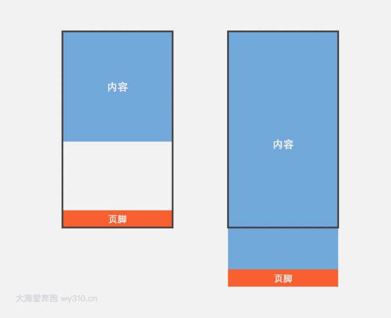
什么是sticky footer布局?
我们常见的网页布局方式一般分为header(页头)部分,content(内容区)部分和footer(页脚)部分。当页头区和内容区的内容较少时,页脚区不是随着内容区排布而是始终显示在屏幕的最下方。当内容区的内容较多时,页脚能随着文档流撑开始终显示在页面的最下方。这就是传说中的Sticky footer布局。是不是很容易理解。不理解的小伙伴也没关系下面我就举个简单的例子。
一般指手机页面中,当内容高度撑不满一屏时,页脚紧贴屏幕底部;当内容高度超过一屏时,页脚紧随其后。
方法一:flex弹性盒子布局
- 父容器container的display为flex,并规定项目排列顺序是纵向的
- content元素的flex为1,即有多余空间就增大
- footer定义一个高度
查看演示请狠狠地点击:flex弹性盒子布局实现sticky footer
内容
body { margin: 0; } .container { display: flex; flex-direction: column; min-height: 100vh; } .content { flex: 1; /*非必须*/ width: 100%; height: 300px; line-height: 300px; text-align: center; color: #fff; font-size: 30px; font-weight: bold; background-color: #71a8da; /*非必须*/ } .footer { height: 60px; /*非必须*/ width: 100%; line-height: 60px; text-align: center; color: #fff; font-size: 30px; font-weight: bold; background-color: #f85f2f; /*非必须*/ }方法二:padding-bottom+负margin-top
- 容器wrapper需要指定min-height为100vh(vh:视窗高度)
- 内容写在content容器里,指定padding-bottom为footer容器的高度
- footer指定高度和margin-top,并且margin-top为高度的负值
查看演示请狠狠地点击:padding-bottom+负margin-top实现sticky footer
内容
body { margin: 0; } .wrapper { width: 100%; min-height: 100vh; } .content { /*padding-bottom应等于footer的高度*/ padding-bottom: 60px; /*非必须*/ width: 100%; height: 400px; line-height: 400px; text-align: center; color: #fff; font-size: 30px; font-weight: bold; background-color: #71a8da; /*非必须*/ } .footer { /*margin-top应等于footer高度的负值*/ margin-top: -60px; height: 60px; /*非必须*/ width: 100%; line-height: 60px; text-align: center; color: #fff; font-size: 30px; font-weight: bold; background-color: #f85f2f; /*非必须*/ }提示:两个/**非必须**/之间的部分不是实现sticky footer布局的必要代码,只是一些辅助样式,可以删除
到此这篇关于css sticky footer经典布局的实现的文章就介绍到这了,更多相关css sticky footer内容请搜索以前的文章或继续浏览下面的相关文章,希望大家以后多多支持!
相关内容
- 史上最坑爹的游戏2 第3关 图文攻略 _手机游戏_游戏攻略_
- 史上最坑爹的游戏2 第4关 图文攻略 _手机游戏_游戏攻略_
- 史上最坑爹的游戏2 第5关 图文攻略 _手机游戏_游戏攻略_
- 史上最坑爹的游戏2 第6关 图文攻略 _手机游戏_游戏攻略_
- 史上最坑爹的游戏2 第7关 图文攻略 _手机游戏_游戏攻略_
- 史上最坑爹的游戏2 第8关 图文攻略 _手机游戏_游戏攻略_
- 史上最坑爹的游戏2 第9关 图文攻略 _手机游戏_游戏攻略_
- 史上最坑爹的游戏2 第10关 图文攻略 _手机游戏_游戏攻略_
- 史上最坑爹的游戏2 第11关 图文攻略_手机游戏_游戏攻略_
- 史上最坑爹的游戏2 第12关 图文攻略_手机游戏_游戏攻略_